Graphics & Resources
One of the things that we writers struggle with is how to make our content more appealing. As a writer or author you’ve gone through great lengths to compose your literary art — whether it be through blogging, article writing, or writing a book. It’s not enough that your words are amazing and well thought out. As writers what we want is for our words to get read. There’s no point in creating beautiful prose, when no one is ever going to see it, right? Every writer wants readers.
But how? How do we find potential readers?
We have to get noticed.
A page of words does not get noticed. There’s just too much visual noise in our modern society. We have to compete for attention in a society whose average attention span is probably between 3-5 seconds. What?! Yes. Sad, but true. I know you’ve all heard of the famous saying, “Don’t judge a book by it’s cover,” but unfortunately my friends, in the world of e-books, books, blogs, and other virtual instruments, the cover is very much judged. It’s beyond judged. The cover of your work is the first thing that will either grab a potential reader’s attention or make them swipe right past you.
Our society is VISUAL.
Just about everything we do now is in front of a screen. We are drawn in, almost hypnotized by the images that come at us via our smart phones, laptops, pc’s, and television. Think about it. We are so visually triggered that technology has evolved to enhance our visual experience — HD is standard now. There are even some screens that are going beyond HD. Visit your local electronics store and visit the television section and see what I mean. It’s crazy how lifelike the images are within the tv. There’s also 3D movies. I don’t particularly like them cause they make me dizzy, but I know people who swear the movie experience is so much better in 3D. Then there’s virtual goggles. Have you tried these? My boys have one. I tried it. It was so immersive I almost fell out of the chair. It’s crazy, but visual stimulation is just going to get bigger and better. It’s a bit sci-fi, but I really think that a not-so-far-future technology will blur the lines between reality and fantasy.
What’s my point?
I think you know… the point is if you want your words seen and read, you have to get the reader’s attention through their eyeballs. You have to get your potential reader’s attention by using awesome VISUALS or graphics with your content. Graphics can come in many forms — pictures, vectors, videos, animation, mock-ups, your imagination is the limit. Entice your potential readers by drawing them in not with your words, but by the sexy graphics you add to your work. Once you can get a potential reader to stop and click on your work, your beautiful words will do the rest of the work and it’ll be magic.
But, if you’re like me and don’t have access to a money tree, a treasure chest, or a bank account with many zeroes gracing the total, you have to get resourceful. You gotta get smart with your sexy. Here’s where I can offer a little help.
Here’s a short list of my favorite resources.
- For beautiful high-definition pictures that are completely free and royalty free, I use Unsplash.com.
- To create graphics for your Facebook, Twitter, and e-book covers, I use Canva.com
- To create mock-ups of book covers, I use Adazing’s free mock-up tool at Adazing.com
Not only are the tools I listed above FREE to use, but they are also fun and easy to use. Again, your imagination is the only limit with what you can create with these tools. Have fun and explore.
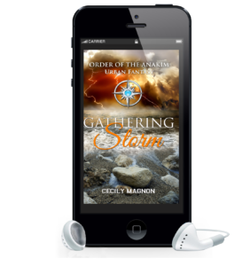
Here’a sample mock up from Adazing.com. 
By the way, you can grab Gathering Storm for FREE at Amazon.com
Book cover is from our friend: Cecily Magnon’s, Gathering Storm.
Featured image by: Georgie Cobbs on Unsplash

